How to choose a logo designer
I feel chuffed to bits when someone asks me to design a logo for them. Why? Because it means that they trust me with their business – or at least the look of it and how it’s portrayed to the general public. It’s an absolute honour to be chosen. And it also usually means that they like the type of work that’s already in my portfolio.
A logo is the face of your business so your logo designer should never be taken lightly. Don’t take pot luck with any old one or just do a google search. A recommendation is always the best way to obtain a good one. Has anyone you know used this person before? Were they happy with the finished product? Did they communicate well? Did they fulfil the brief that they were given?
Portfolio
The first step to commissioning a designer is to check out the work that they’ve already done. This is what it says in my About Me section:
I truly believe that it’s important to like a designer’s previous work before you commission them. If you don’t like what they’ve done already, it’s highly likely that you won’t like what they’re going to do for you. I hope you like my work but if not, then it’s probable that I’m not your type of designer. And that’s absolutely fine. Every designer has their own style. You just need to find someone that is your type of creative.
I’m going to stick to this. It’s bloody good advice.
Budget
I know that budget is a huge factor for some people but don’t let cost be your main deciding factor. Yes you can buy a logo for £20 from some cheap ‘designers’ but I think this is a false economy as I’m fairly sure that it won’t be up to scratch and you’ll probably want to change it in the next six months or sooner! A well designed logo should last you for a good few years. You don’t want to confuse your customer by changing your logo constantly as it will look like you’re having an identity crisis. I’m NOT a huge believer in the sayings: ‘buy cheap, pay twice’ or ‘pay peanuts you get monkeys’ as I know that there are some good designers around who don’t know their worth and give away their skill for next to nothing but they are few and far between. And do you really want to try all the £20 designers before you find a good one? Sounds mighty expensive to me. Research is key when putting together ideas for a logo. The market needs to be looked at along with what the client’s competition is up to. How on earth is a £20 designer going to do research for you for such a small fee? Well, the answer is, they won’t. And as a result you could end up having a very similar logo to one of your competitors. How awful! So don’t let the money issue sway you into choosing a designer. This factor should be way down your list of priorities.
Questions to ask
How many logo designs do you get for the fee? How many revisions do you get? What if you don’t like them? What format will you receive the final logos in? Do they use clip art (urgh)? Ask lots of questions as the designer will in turn ask lots of questions back.
What is vector?
Every designer worth their salt will design a logo in a vector format. If they don’t, then put the phone down, exit the meeting or don’t return their email. It’s standard practice for a professional designer to produce a vector logo. If you’re not familiar with this definition then let me give you a very quick run down. It’s a format that’s not pixel based. You know when you see a photo that has been enlarged and you can see the pixel size? Looks awful doesn’t it? A vector logo won’t do that. You can blow it up to billboard size and it will still keep its integrity and sharpness (like text) no matter how big you enlarge it.
Colours
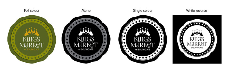
All logos should work in black and white (alongside the colour versions) and scale down well if needed to be used small. The reason for having an all black/white logo is normally due to cost printing factors. For example; promotional companies who produce items such as t-shirts, mugs and pencils, usually charge for each separate colour printed. Also, if you’re printing your logo on a pencil, it’s highly unlikely that you’re going to print it in more than one colour. Note: These companies always ask for a vector (not jpg) logo..
Take a look at the logos below that I designed. The colour one is the logo of choice but the mono ones are also always provided. They may never be used but it’s always good to have them at the outset – just in case.
Summary
So this is a relatively quick(ish) run down of what to look out for and what to avoid. I’m sure that you’re aware after reading this that Absolutely Kareen always designs vector based logos. She always give you a black and white alternative (as you never know when you might need one) and she never uses clip art. As an extra nicety, a breakdown of the colour values used in your logo (in rgb and cmyk) will be provided so that you can emulate the colours in other software if needed. Oh and you get three logos to choose from – as she likes to give clients a choice.


