Silhouettes: The Good, The Bad and The Downright ‘Orrible
Goodness me. I’m so bored of seeing silhouettes being used in design. The first time I used them was over 20 years ago when I drew the outlines myself with the aid of Adobe Illustrator – or was it Macromedia Freehand (the precursor to Illustrator?). It was when I was working for an agency in the Docklands. The client was the London Borough of Barnet and I designed an exhibition stand for a jobs fair. The design was brilliant (if I do say so myself) and quite innovative for it’s day. I traced round images of people in different professions and then interspersed these images with job titles to illustrate the jobs that Barnet council offered. I distinctly remember getting really positive feedback about it and I felt chuffed to bits.
Fast forward twenty odd years later and you see silhouettes everywhere. And hands up, I’m guilty of using them myself. I’ve used them a lot over say the last five years as they’re easy and fairly effective. You can purchase an image with around 20 or so silhouettes of people in different poses; adults, kids, males, females, there’s animals, birds objects… I think you get the picture. And the images are cheap to buy or sometimes even free. Here’s a not so nice example of the type of design that I dislike.
Originality
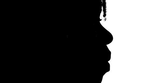
Try and be original. If your silhouette is the profile of someone’s face which is fairly distinctive then hats off to you – this will look brilliant. Below is a profile silhouette of myself. It started life off as a photo which I then darkened and lightened in the appropriate places. You can do this yourself with basic software. If you have dark skin, take your profile on a light background. Fair skin, take it on a dark background and inverse it. Pale skin but dark hair – then take it on a white background and colour in the light areas. Yeah, I know I make it sound simple but it really is.
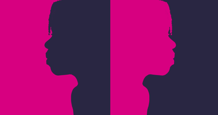
Self Portrait as art
Patterns
If you really must use a royalty free stock image then try and jshoosh it up a bit. Get a basic silhouette and add something to it. Maybe put a pattern inside it to give it some added oomph and originality. Or how about a silhouette within a silhouette?
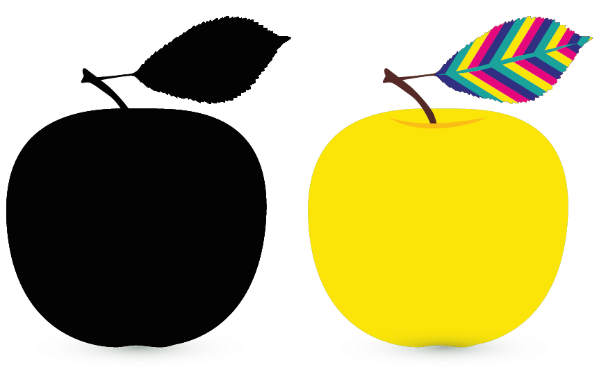
Pattern overlay
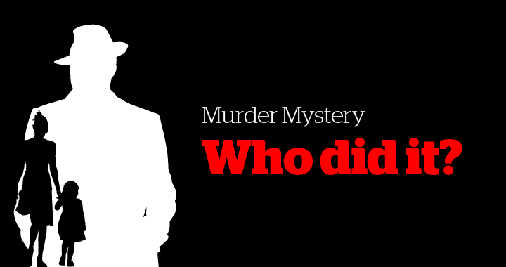
Silhouette within a silhouette
Photos
I love a photo taken in front of a sun setting or sun rising to make a natural silhouette. Don’t play around with it. Leave it as is. It’s naturally gorgeous like the photo taken below. And no, you don’t have to be somewhere hot and sultry to get a good photo. This was taken last year in Ponders End, North London.
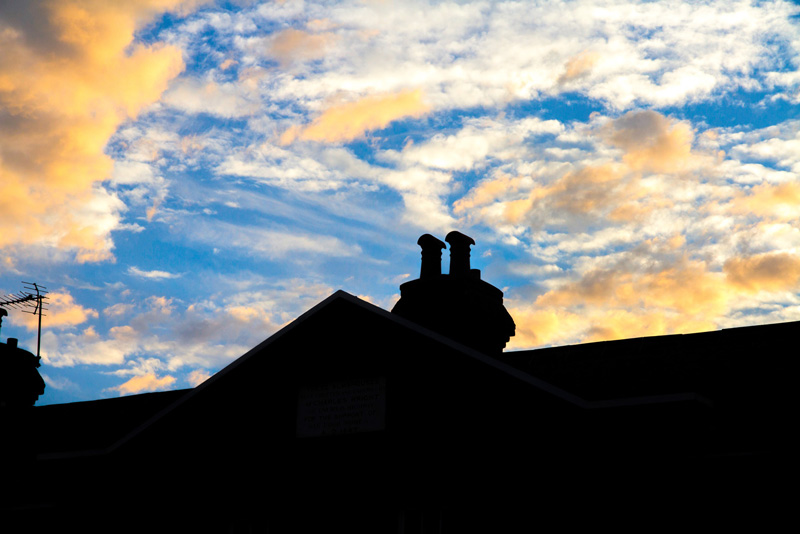
Ponders End, London, housing silhouette

Sunset: Lake Garda, holiday silhouette
Inspiration
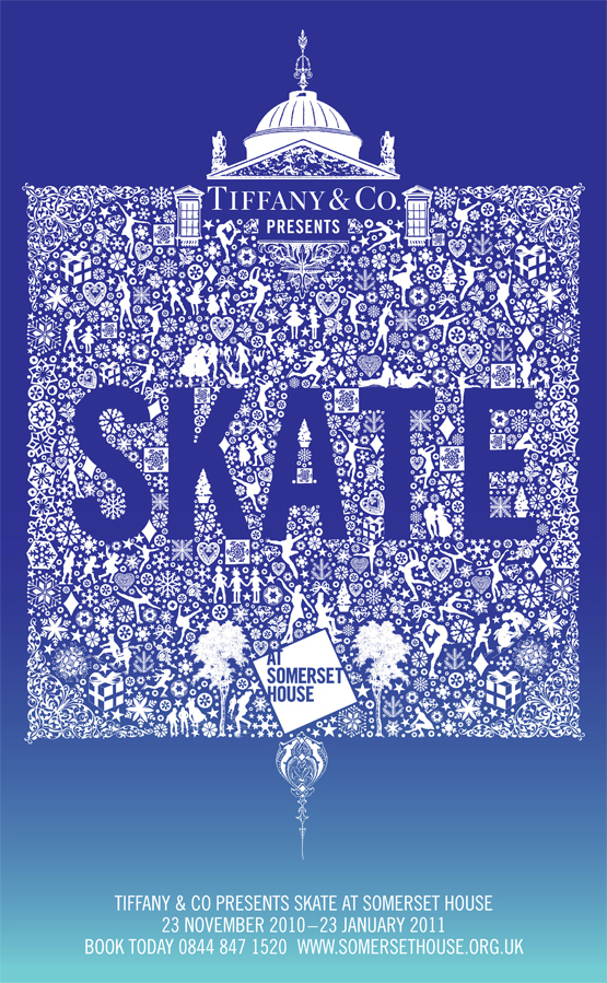
If you’re stuck for ideas, search the internet. Take a look at this design done by johsonbanks.co.uk. It’s a beautiful piece of work. They may or may not have used royalty free images for the graphics but nevertheless, they’ve reworked it so that it’s a one of a kind piece of art. They have more samples on their website.
There are some stunning ways that you can use silhouettes in design. Take a look at the examples below.

Django Unchained film poster
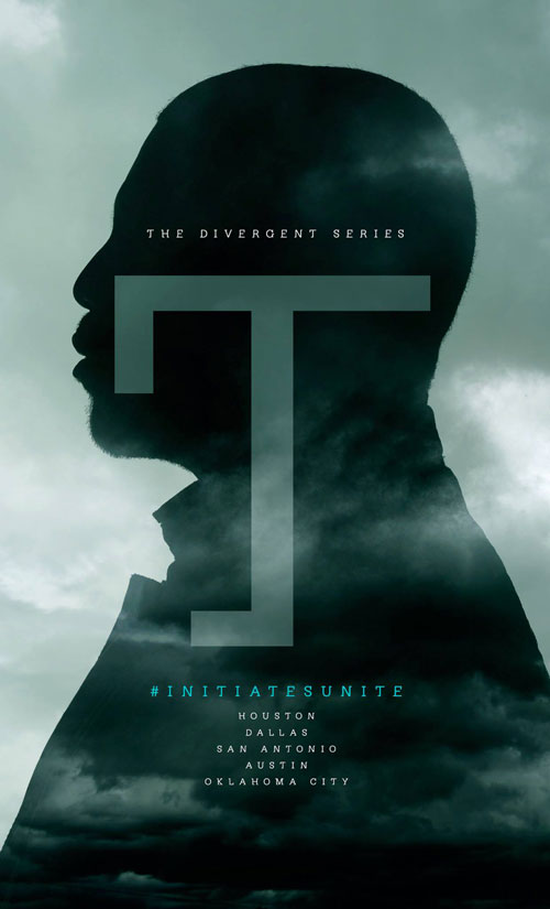
Poster from the Divergent film series
One final word
If you really want to use silhouettes in your design then take a look at this website: all-silhouettes.com. I don’t use it but a quick google search yielded this result. A lof of the images are downright ‘orrible and you really have to separate the wheat from the chaff but everyone to their own! Just try not to use it as just a black and white image unless it’s part of the stark design that you’re after (like the Murder Mystery image example shown above) and do something amazing and interesting with it. You may need to use more than one image to achieve your desired effect. And don’t be scared of colour. Give it some va va voom.
By the way, the top image isn’t one of mine. You can download it for FREE here. And yes, I think it’s ‘orrible.

